by Stacey Wiseman | Mar 20, 2013 | Photo Book Design Layout
 Q: How should I combine photos of my kids with photos of objects?
[divider]
 A: This is such a great question. Often times we only want to photograph or print the photographs that have people in them. But sometimes the objects (toys, food, paint, bubbles, shoes, etc) can be just as telling and instructive about our daily lives – what we love, what we do, how we do it.
It can pose a bit of a challenge for how to combine the portraits with the still life’s when it comes to photo book layouts. Typically, I like to combine similar photographs to a spread. In these examples, I want to show how combining objects and faces on a layout can work.
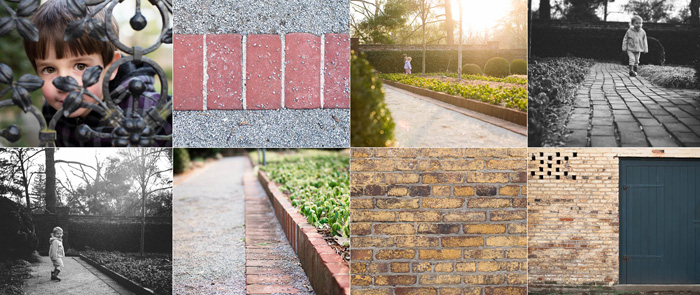
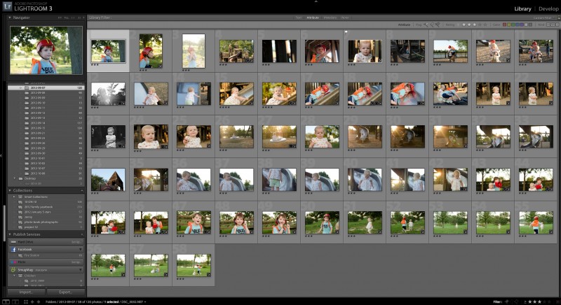
Here are a couple of strategies for you to consider. To test these strategies, I used this grouping of photos.

[1]
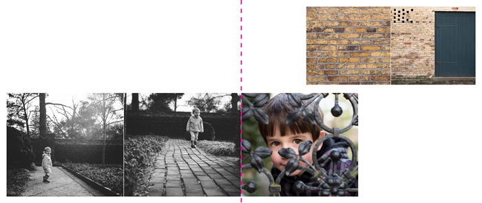
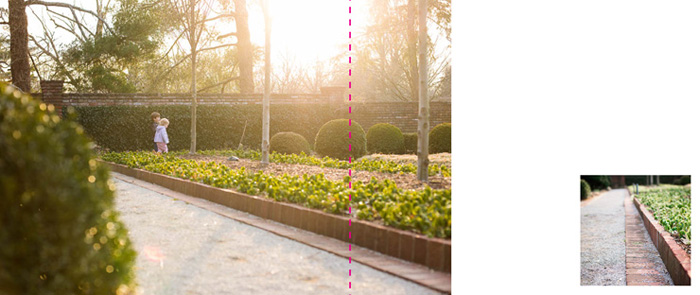
Group your similar photos together.
In this scenario, group your portraits together and group your objects together. This option provides a clean break between the two different types of photographs. By bridging the center line of the page, I’m subtly suggesting there is more of a blur or crossover than the initial grouping suggests.

[2]
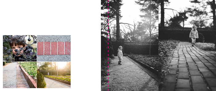
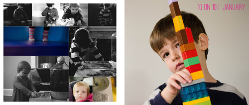
Mix your photos.
To mix the photographs together, I’m using a collage-board type layout. The object photos are interspersed with the portraits. In this set-up, there is no hierarchy or preference between the two different types of photographs.

[3]
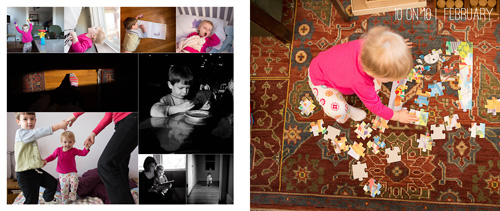
Use negative space to separate your photos.
I used negative space in this layout to separate or segregate the photos. To play a little bit with the layouts (don’t want to be too rigid!), I mixed the types of photographs together to heighten certain connections and relationships. Grouping in this way tells a different story.

[4]
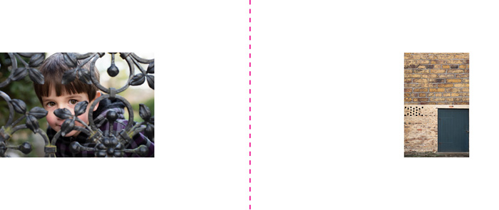
Use scale to isolate or group.
Finally, one option is to use scale to create distance. This is an easy way to feature the photograph you want to show, in this case a portrait, but also reveal the other aspects that inform the portrait.

Now, I’d love to hear from you. Leave a comment below with your favorite layout. I need help trying to decide which one should go in my photo book!
by Stacey Wiseman | Mar 14, 2013 | Family Photographs, Photo Book Design Layout, Podcast

In this month’s podcast, I’m showing you how I design my family photo book, step by step. For this video, I’m illustrating how I designed my January and February 10 photos in 10 hours challenge.
Even if you are not participating in this challenge, it will show you how I export and select my photos for a layout.
If you are designing your own photo book, I hope you’ll follow along with me as I design my 2013 book. And if you’re interested in having me design your photo book, this will provide some insight and tools into what I can do for your photographs!

If you have any questions or comments, make sure to leave them in the comments below!
by Stacey Wiseman | Feb 21, 2013 | Photo Book Design Layout, Q&A

Selecting photos is one of the first steps to photo book design. The photographs are what really provide the story, backbone and purpose for your photo book. And selecting photographs can be one of the first stumbling blocks to actually completing your photo book. That is the focus of this month’s Q&A!
 How do you select photos for a photo book?
[divider]
 1. Select photos that you immediately love.
You should select photos that you melt your heart when you see them. They could be technically great photos, with tremendous clarity or use of light. Perhaps they have an artistic creativity in its composition or content that immediately draw you in. Or, they can be photos that you perfectly capture the essence of your loved one or a moment that you want you want to freeze in time forever.
Of course, a particular photo addresses all three of these qualities, you will want to feature this photo as large as you can in your photo book.
2. Select photos that tell the story.
If your photos document a specific event or story, use an editorial eye to select the minimum number of photos you need to really tell the story. An example, if you want to include two pages in your photo book to feature a trip you took with your family to an amusement park, what are the necessary photos you need to tell the story of the day? I’m assuming you will have a lot of photos from the day. Maybe getting your tickets, riding roller coasters, driving bumper cars, eating lunch, watching a performance, and indulging in an afternoon snack. It’s important to think about what you want to describe from the day and what photos you need to really tell the story.
You may have a series about riding the roller coaster. Select 3-5 photos from this set. You may have four photos that you want to use to describe the morning (arrival), late morning, lunch, and afternoon. Finally, you may have a photo that you want to feature as a 5×7 somewhere throughout the spread. For this select your favorite aspect of the day; then the favorite photo to show that moment. It could be a portrait with a great smile and a toy that they received while at the park.
3. Select photos for their orientation.
When selecting photos, it is important to keep in mind the orientation of the photos you are selecting. Picking 3 horizontal photos and 1 vertical photo forces a very different layout from 4 horizontal photos that can all go in a square. Nothing is off-limits, it just helps to understand the concept of orientation early on. Often times, I like to layout photos in a square (all horizontal or all vertical) in groups of 4 (2 rows of 2) or 9 (3 rows of 3). This sets the orientation and the quantity so you know right away what you are looking for when your picking out photos.
4. Select photos for their processing.
Another preference I have, is to select photos with similar processing styles on a spread together. This means, all color photos on one spread and black and white on another. If you have three photos from a day that are black and white, stick with those 3. Now all you have to determine are the sizes.
5. Select photos for the quantity.
Similar to number 3, determining the quantity of the photos you want to capture an event or tell a story is a crucial first step to selecting your photos. This helps to define and limit what you are choosing. For some days, you may really only love 1 photograph. Other days, you may 300 photos. You could do 9 small photos on one page and 4 medium sized photos on another. This way, you will use the quantity of 13 to select the very best photos to include.
All of these tips will help guide you as you are looking through your catalog or folder of photos to determine what photos you should use in your photo book.
Let me know in the comment below, what quality makes you immediately love a photo!
by Stacey Wiseman | Feb 1, 2013 | Cover Series, Photo Book Design Layout
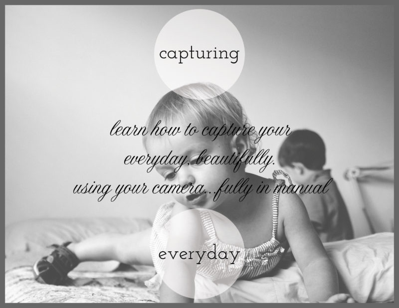
For today’s photo book cover, I’m featuring something I’m working on for my brother and sister-in-law. They just had a baby and want to know some basics of their camera. So I created a little pamphlet and this is my cover.
I know I have a limb chop with my daughter’s hand, but there is something that really speaks to me about this image – especially when discussing everyday photos in my home. I used a circle graphic with a slight transparency to bring the background in.
And I’m using two different types of fonts – serif + cursive – to distinguish the Main Title from the Sub-Title.
One final think, I added a gray border to give a sense of enclosure and framing. It also highlights the two different shapes going on – the square and the circle!

by Stacey Wiseman | Jan 4, 2013 | Design Series, Photo Book Design Layout
It is time to start the next Design Series! Every Friday, I like to post a different photo book cover design to inspire you for your photo book. This year, I may start to include design layouts, as well.
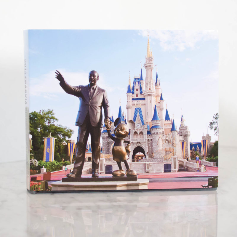
This cover comes from a recent family vacation book I completed. I will blog about this book later this month…but I love the cover. I thought this photo was perfect for the cover, so much so, that words were not required. The only text occurs on the spine of the book.


Photos copyright Tricia Ebarvia. All rights reserved. No reproduction of photographs permitted without expressed consent from photographer.
by Stacey Wiseman | Dec 6, 2012 | Photo Book Design Layout, Photograph, Promotions
And why should I consider it for my family photo book?
These are two very good questions!
I think printing a photo book, especially once a year, is so important. But let’s face it. Sometimes time runs out and you just don’t have the time at the end of the night or on the weekend to design your own family photo book.
I have an alternative for you! I will design your photo book tailored to your tastes. It is the easiest way for you to finally get those photos off your hard drive and printed all in one place.
I’m trained and practice as an architect and have a very modern, sophisticated design sensibility when it comes to design. But what does that mean?
Let me explain some of my design principles and why I think it is beneficial for you to consider my custom design services. All of the books below are examples of books I designed for others (including myself!)
1. I can match your preferred font.
This client wanted to match the font from her blog where she showcases her lovely Project 52 photos. With a bit of research, we found the font and I used it in the title of each page for her book. Now there is continuity between her blog and her photo book!

All photographs in this layout are copyright to Tamra Yandow. All rights reserved.
2. I can organize your book to your photos.
For this client’s book, she wanted to use her child’s artwork for sections. And she didn’t have a lot of photos each month, so she wanted her photo book divided into seasons, not months. I easily organized her book to match the amount of photos she had.

All photographs in this layout are copyright to the Shumaker family, 2011.
3. Custom design does not mean design, patterns, colors, lines, and font everywhere.
Sophisticated design relies on simplicity in order to elevate the photos on the page.
For this Project 365 book, I matched the color in her photo to expand it to a full spread layout. Now there are no distracting elements (even if white space) competing for your attention. Only her photograph!

This photograph in this layout is copyright to Suzie Mauro, Zo-mak Photography. All rights reserved.
4. I can design to a specific idea.
I had another client was curious how implementing circles would look in her vacation photo book. This approach is very difficult to achieve with the free design programs, however, very simple for me! (I’m still in the process of finalizing her book, so this is a sneak peek from her draft!)

Photos copyright Tricia Ebarvia. All rights reserved. No reproduction of photographs permitted without expressed consent from photographer.
5. I can include basic information, such as capture dates for photographs.
I like for all of the pages in my photo books to include a date when the photos were taken. This becomes very tedious when you design a book on your own. I love to go into this kind of detail for you!

6. I can match design inspiration from pinterest.
See a design you like? Pin it and I can use it as inspiration for your book. This is a sample of something I found. See how the first number tucks behind the photo and the second number is in front! This could make for a gorgeous section divider. It is simple yet has the design sophistication that shows thought and intent.

7. I don’t have to shy away from color or pattern.
Sometimes the careful use of colors or patterns add just the right touch for your photographs. For my family vacation book, I wanted just a bit of color and pattern to pop the photos a bit. This is not on every page. Only a few where I think it really works.

8. I can design special inserts or elements into your book.
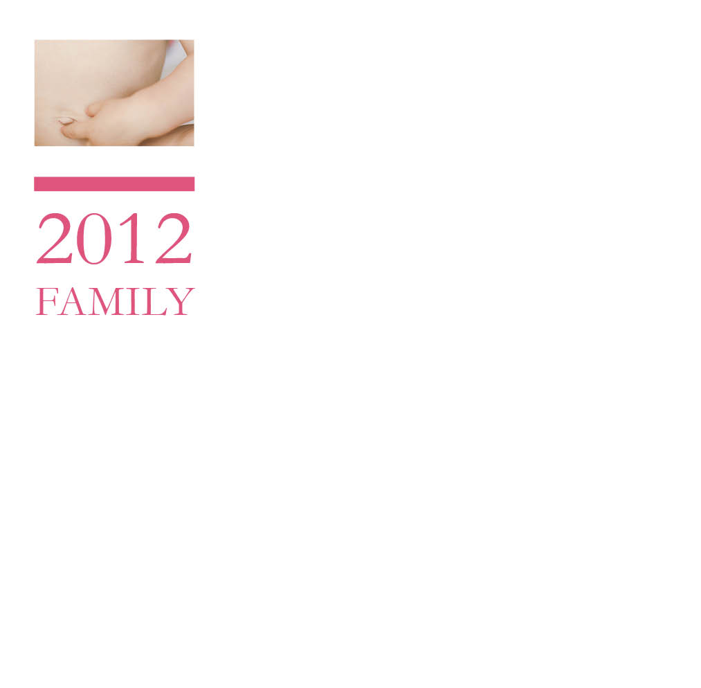
For my 2012 photo book, I am going to provide specifically designed pages for the monthly projects I participated in. This is an example of how I will incorporate food – family meals, baking, recipes, etc. – into each month of my photo book. Every time I have one of these pages, it will follow a similar layout to keep consistency throughout the book.

Now you see what I can do! Whatever your book project idea – I would love to design it for you! Think of the stress and hours I can save you with absolutely beautiful results.
If interested, sign up to become a 2013 BTP Subscriber. For a monthly fee, you upload your photos each month and I will take care of the rest. Or for a book from any year, I have a family photo book option.
Right now, I am giving away one free hard cover book + custom design service to one lucky reader on my newsletter. To enter, make sure you are on my list by December 14, 2012! For more details, check out this thread.
If you want to learn my design techniques to implement yourself, sign up to find out when I’m offering my next Intro to Photo Book Design Workshop!
by Stacey Wiseman | Nov 30, 2012 | Family Photographs, Photo Book Design Layout
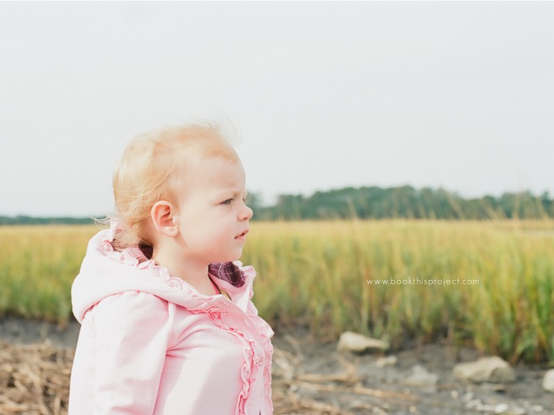
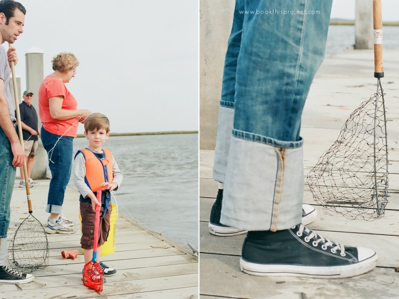
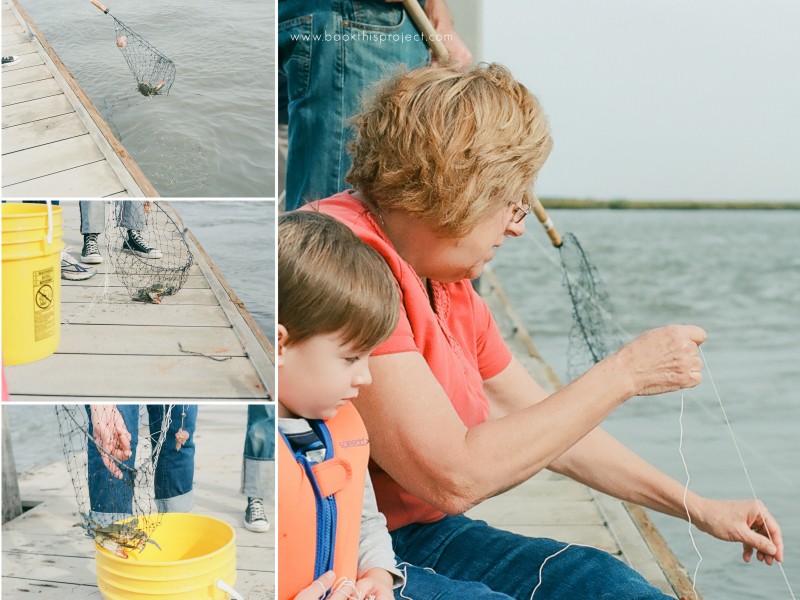
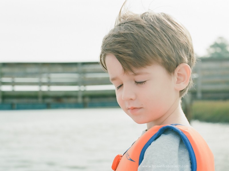
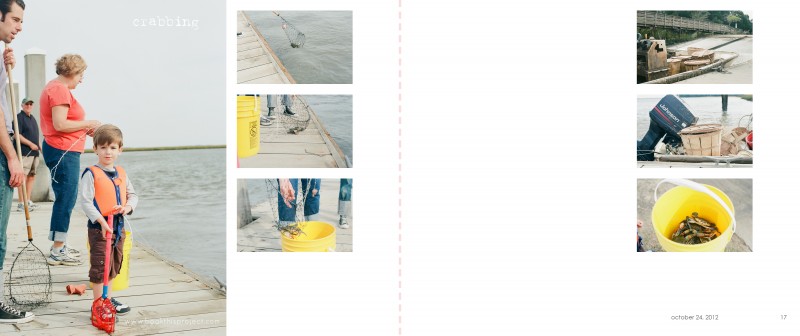
This year we took a family vacation to South Carolina. At the end of October. Not exactly beach season. But the weather was fantastic for us. Comfortable, clear blue sky, not too hot, but definitely sunnier than the place we left. One morning of our trip we decided to go fishing for crabs. I decided to be brave and only take my 35mm film camera loaded with Ektar 100 film.
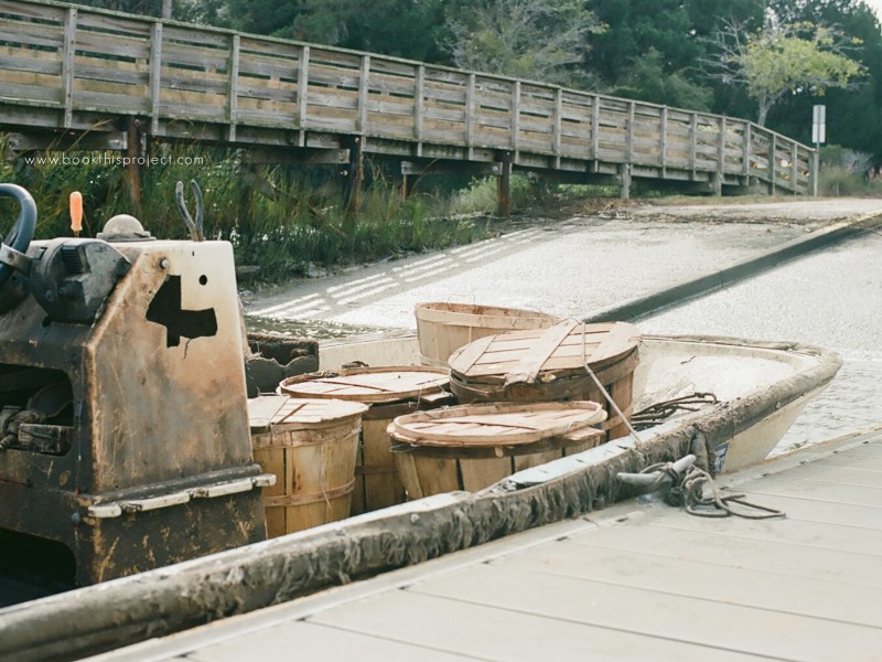
My mother-in-law ended up catching two crabs. Not a lot…but better than I expected. Even though my son sat around and watched for most of our time on the dock, he still felt part of the action and really enjoyed it. While we were waiting for the crabs to bite, a seasoned fisherman pulled up with his baskets and baskets of crabs.
Here are some of my favorite from the trip.


Now, how will all of these photographs translate into 2 pages (left and right) of a photo book? I wanted a layout that is simple and focuses on the actual act of fishing for crabs. I wanted a subtle caption of “crabbing” to describe the day. And, like all of my layouts, I wanted to include the date of when the photographs were taken. So here is what I came up with!

Leave a comment below and let me know what you think of the film photos or my layouts! I definitely need more practice…but I get so excited when I see my film experiments!
by Stacey Wiseman | Nov 16, 2012 | Cover Series, Photo Book Design Layout

If you love this example or if it gives you some ideas for your photo book, pin it!
[divider]Make sure you sign up for the Book This Project weekly newsletter. I have a free download when you sign up!
by Stacey Wiseman | Nov 15, 2012 | Photo Book Design Layout, Podcast
Are you planning on designing and ordering a family photo book before the Christmas holidays? If so, the dates are quickly approaching to when you need to finalize your design and place your order. Even though the ordering process can seem straightforward, reviewing before you order is critical to ensure a gorgeous book.
 Here are 7 simple steps to follow before you press “Order.”
1. Fix warnings
Most free online programs alert you of potential errors to your design. A common error is the image resolution being too low. You need to reduce the size of image or re-save the image at a higher resolution. Another example involves text that does not fit the text box. In this instance, you need to lower the size of the font or increase the size of the text box.
2. Ensure photos extend to edge of photo boxes and bleed edges
For any photos you want to bleed off the page, make sure they extend to the bleed line.
3. Review consistent elements (text, borders, page numbers)
If you established consistent elements at the beginning of the design process, check every page to ensure all elements have been consistently applied. This includes all text styles, borders, headers and / or footers.
4. Read through all captions
Read through all captions for any grammatical or spelling errors. A great tip is to read all text aloud. I tend to catch more mistakes this way!
5. Preform a spell check
Most programs will also have a spell check. Check the entire document before you order.
6. Print a proof, if desired
This step takes the extra measure to verify proper grammatical and design elements. Sometimes we fall into the illusion that we can catch everything on screen. Printing out your draft and reviewing the proof is visual proof you have got the book exactly the way you want it. Get out that red pen of yours and mark up your proof.
7. One Final check
After you have gone through the six steps above, I go through each page in preview mode one last time to see if I notice anything else. If I have no additional edits, I’m ready to hit that order button!
As some of you may know, my family recently returned from our yearly beach vacation. I prepared a photo book documenting our vacation. Here are a couple of pages of my book.
[divider_flat] I went through all of the 7 tips listed above and pressed “Order.” Want to see what happens next?
Watch this quick video below to de-mystify the ordering process!
Leave a comment below to let me know when you plan to order your photo book!
by Stacey Wiseman | Nov 9, 2012 | Cover Series, Photo Book Design Layout
Description

If you love this example or if it gives you some ideas for your photo book, pin it!
[divider]Make sure you sign up for the Book This Project weekly newsletter. I have a free download when you sign up!
 Q: How should I combine photos of my kids with photos of objects?
 A: This is such a great question. Often times we only want to photograph or print the photographs that have people in them. But sometimes the objects (toys, food, paint, bubbles, shoes, etc) can be just as telling and instructive about our daily lives – what we love, what we do, how we do it.
