by Stacey Wiseman | Sep 18, 2012 | Photo Book Design Layout
Two weeks ago, I had a post about my daughter’s new (and slightly too big) dress (here). In this post, I am going to share with you how proportion factor into photo book layout design. If you have ever had to print the same photo as a 4″x6″ and a 5″x7″ or 8″x10″, you realize that each of those show a little bit different crop of the photograph.
What works as a 4″x6″ does not always work (or work as great) as an 8″x10″ photograph. This is true for photo book design as well. You may love an image and want to feature it large in your book, but it may not work.
The concept of proportions is most easily described through photographs, so let me demonstrate.
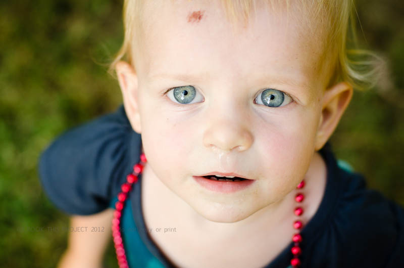
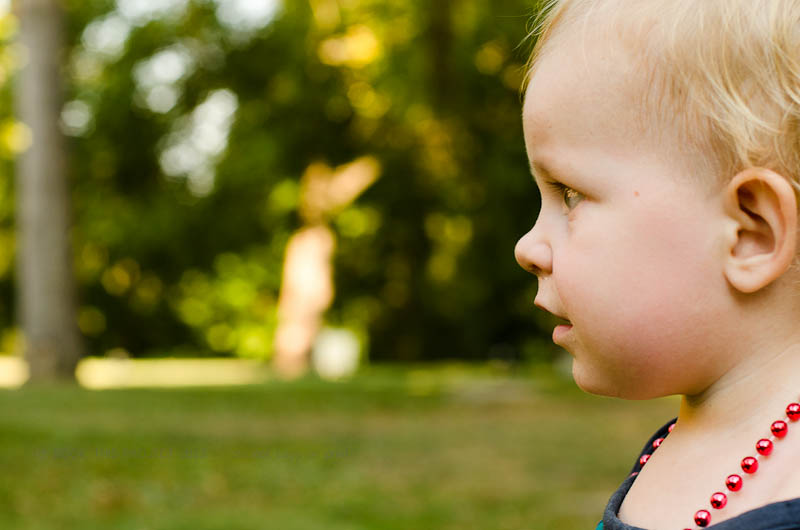
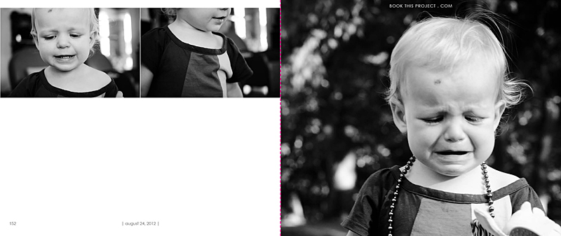
I loved this photograph of my daughter.

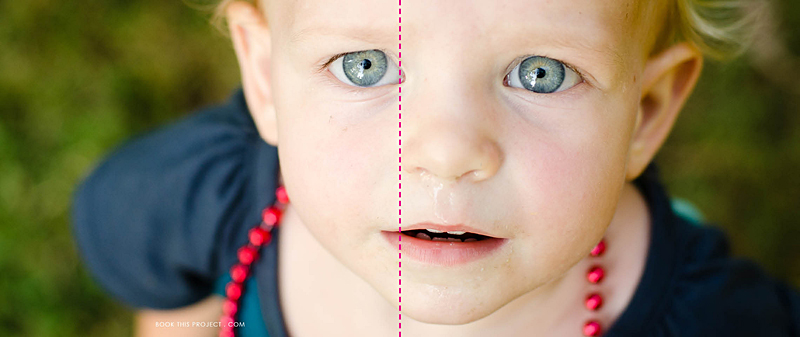
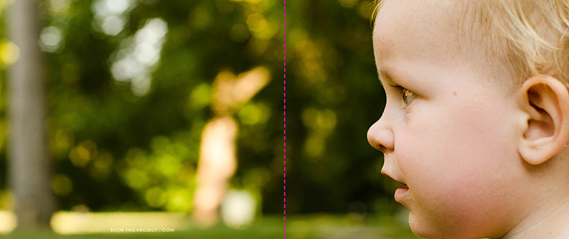
And as you know, I also love to feature my favorite photographs as a full spread (image on both the left and right hand side of the page). But this photograph is not the right size for a full spread.

The pink dashed line indicates the center of the book, or spine. See how the pink line goes right through her eye. Not good! The layout design is taking away from the best part of the photo.
Plus, do you notice how her boo boo is now missing? This is because the proportion (the width in relation to the height) of the photograph is different as a 4″x6″ photo than when it is put in a photo book which is 8″x20″.
To clarify a little more, we doubled the height (from 4″ to 8″) but we more than tripled the width (from 6″ to 20″). If you wanted to keep everything in the 4″x6″ photo, you would need a 8″x12″ photo box in your layout. Does that make sense?
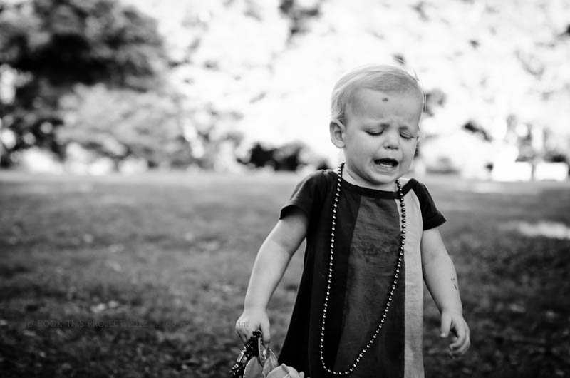
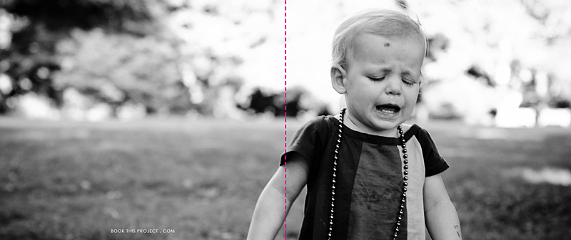
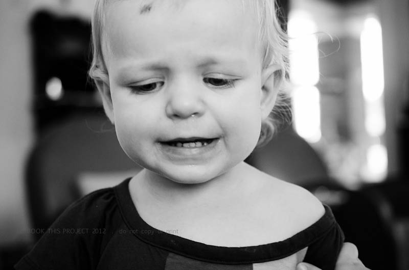
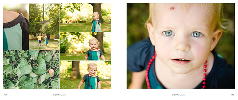
Here is a an improved example.
Photo:

Layout:

In this example, the action, or main focus of the image is occurring primarily on the right side. It is true that her arm is located in the spine of the book, but this does not take away from the purpose of the image…which happens to be her frustration!
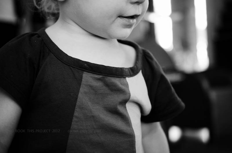
For the final example, I think this photograph lends itself really well to a full spread layout.
Photo:

Layout:

As you can see, selecting each photo and how it is shown on the page takes more than just selecting your favorite photograph. Key to any great photo book design is knowing how to design the layout that best suits the photos.
Let me know in the comments below, did this inspire how you will design your personal photo book?
by Stacey Wiseman | Sep 3, 2012 | Family Photographs, Photo Book Design Layout, Photograph
My family knows I am not big on shopping. Rarely do I buy clothing for my kids (even more rarely do I purchase clothes for myself) but recently I met a wonderful woman in Lexington who owns a maternity and children’s clothing store in Lexington. Blossom is the store and anyone located in Lexington should definitely check them out. I realize most of the back-to-school shopping has passed, but if you need clothing for the fall, going to Keeneland, a special occasion, or a Christmas gift, I suggest you head there first.
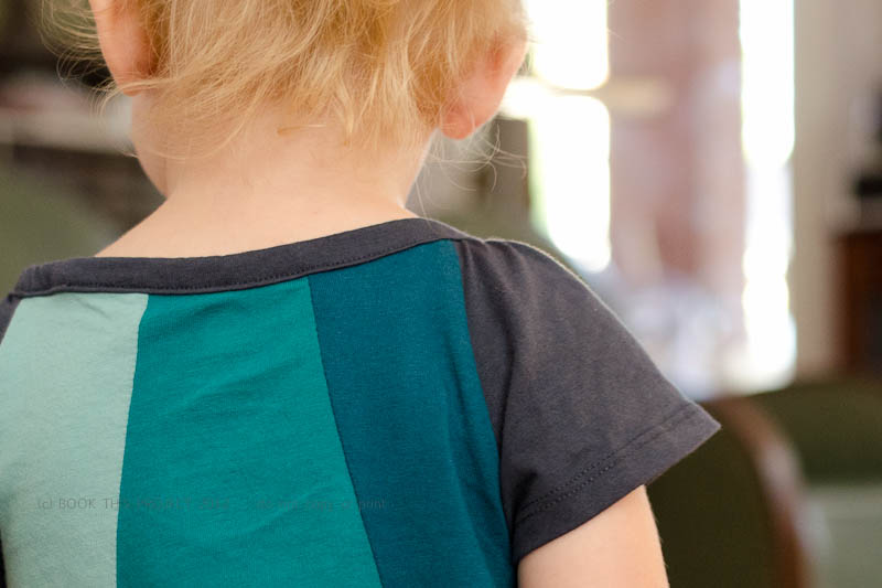
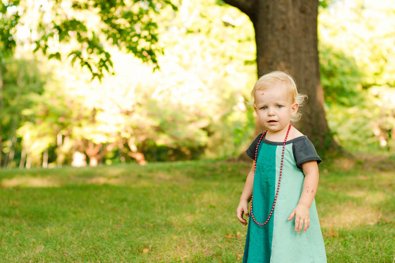
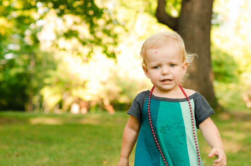
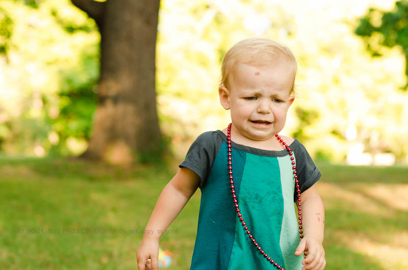
I still have to get my boy out in his new shirt, but I spent an afternoon photographing my little girl in her dress. It is a little big on her…but this will give her plenty of time to wear it! I really love the colors of the dress. Of course she added the beads. She did get a little messy during dinner but I made sure to soak it water at the end of the evening and all it good!
[divider]


[divider]I thought you would enjoy seeing how these photographs translated into the pages for my annual family photo book. I love her smiles and her cries. Whenever I photograph her, I always work with her running away or looking away from the camera. We kept playing this game where I would get her looking toward setting sun and then I would run a couple of steps in front of her, turn quickly and then try to capture her as she was running back towards me.
Since I adore several of the photographs, I decided to dedicated four pages – or – two spreads to this set. The first page features the black and white photographs and the second page features a variety of photo at different scales, features and colors. Each pages features a page number and the date. The pink dashed line represents the fold of the pages and will not be included in the actual book.


[divider]Let me know what you think of her dress, the photographs and the layouts in the comments below!
If you love this example or if it gives you some ideas for your photo book, pin it!
[divider]Make sure you sign up for my weekly newsletter. I have a free download of 50 things to shoot for your photo book when you sign up! (click the image below)
by Stacey Wiseman | Aug 9, 2012 | Description, Photo Book Design Layout, Podcast
It is time for another video podcast! In this month’s podcast, I translate the outline from the previous video (see this link here to watch that video!) into an actual photo book structure. Using Adobe InDesign and the free software program from Blurb, I take you step by step as we create stand-in pages for the entire book. Once the structure is in, you will have a framework – or a to-do list – to begin filling in the pages.
And speaking of starting to fill in the pages with photos…stay tuned for next month’s podcast where I start that process. Looking for the easiest way to know when this podcast is released…sign up for my free weekly email!
by Stacey Wiseman | Jul 12, 2012 | Photo Book Design Layout, Podcast
Check out the latest podcast to find out the easiest way to transform your photo book into a professional book.
To receive your free excel spreadsheet guide, click here!
Share with everybody your biggest a-ha moment you learned from this podcast in the comments below.
by Stacey Wiseman | Jul 4, 2012 | Family Photographs, Photo Book Design Layout
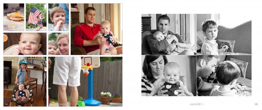
I hope everyone is having a fantastic fourth! Usually the Fourth of July is a busy holiday for us. They have an annual road race with the route right next to our house. So we wake up early and watch the runners…with our coffees! And for dinner we had to my in-laws for a grilled feast.
I thought I would share my spread from the 4th in my 2011 photo book. The layout was prepared in Adobe InDesign. Because there were so many events that occurred, I wanted a layout that allowed a lot of photos in one spread.

I want to hear from you in the comments below. What is one thing you will definitely do on the Fourth of July? Picnic? Pool? Movie? What are your traditions?
by Stacey Wiseman | Jul 2, 2012 | Family Photographs, Inspiration, Photo Book Design Layout
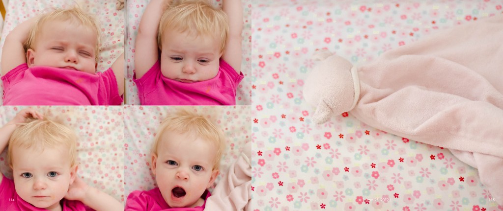
Last week, I wrote about my daughter’s favorite blanket. But let’s be honest, sleeping – even waking up photos – are adorable and a must every year for your kids. I took several photos, maybe 30 and selected my favorites to include in my annual family photo book.
To make it easier to select which photos, I had my layout in mind. I knew I wanted four photos on the left hand side of the layout and one photo on the right.
For the left page, I wanted four different facial expressions of my daughter waking up.
For the right page, a detail of the blanket would keep the layout simple and to the point. About my daughter – her sleeping, waking up, and her blanket.
This layout was prepared in Adobe InDesign and has the signature design elements of my photo book, page numbers and a date to document when these photos were taken.

by Stacey Wiseman | Jun 22, 2012 | Description, Family Photographs, Inspiration, Photo Book Design Layout
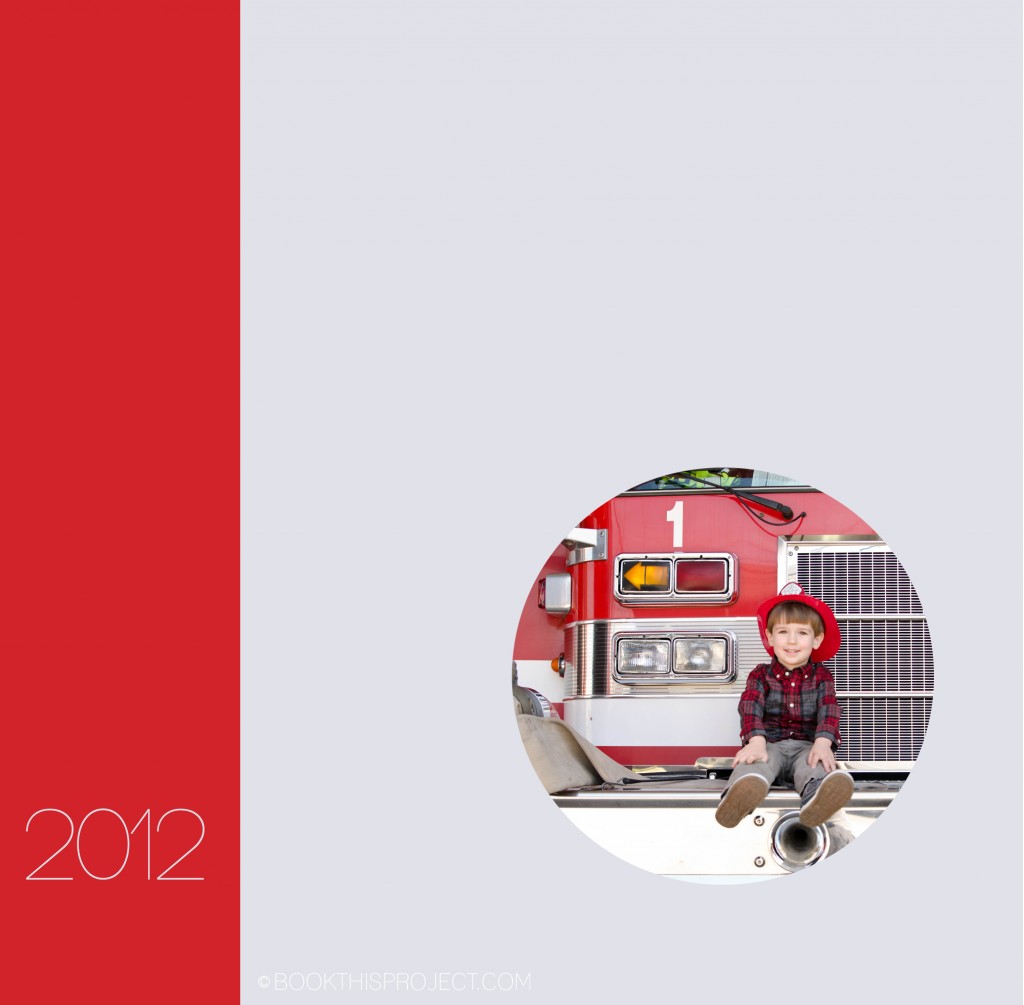
My intention for this book cover idea is to have the red bar wrap around the spine and the back. The front cover has a photograph of my son; the back cover features my daughter. These photographs speak more to their adventures as a kids and so I have titled this example: “Adventures in 2012.”

[divider] If you love this example or if it gives you some ideas for your photo book, pin it!
by Stacey Wiseman | Jun 15, 2012 | Description, Family Photographs, Inspiration, Photo Book Design Layout
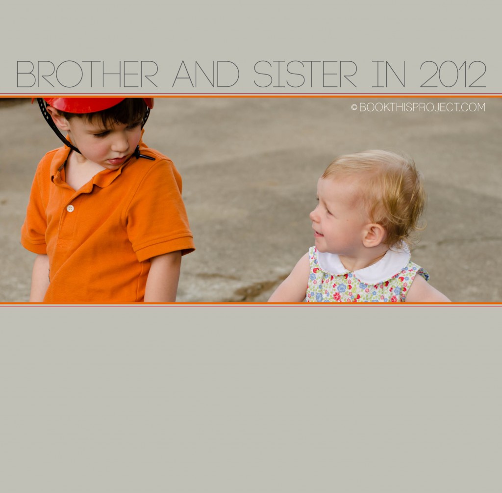
Today’s 2012 Cover Series highlights the interaction between my two children. I have cropped it tight to focus on their glances and I used two small lines at the top and bottom of the photograph to symbolize my two kids. The title is simple and points out the focus of the photograph selected for the cover. Plus it gives some indication that in my family book, I am going to focus on them – brother and sister!

[divider] If you love this example or if it gives you some ideas for your photo book, pin it!
by Stacey Wiseman | Jun 8, 2012 | Description, Inspiration, Photo Book Design Layout
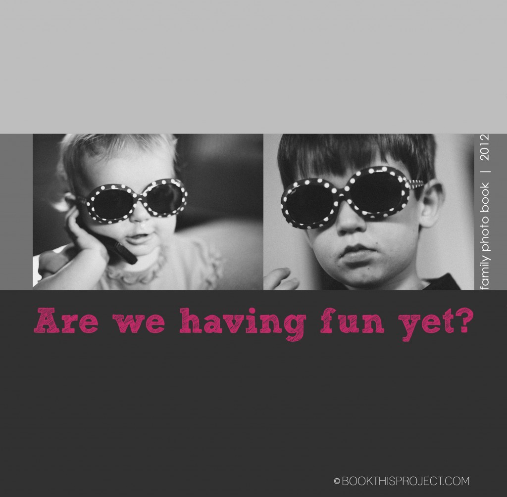
My previous cover examples all feature one photograph. In this cover design, I am featuring one photograph of each of my children. However to tie them together, the two photographs have something in common – sunglasses. They are wearing the same sunglasses and I thought it was really cute, not only of my little girl wearing her glasses…but also big brother! This is a great tip for you as you begin thinking about your cover. Perhaps it is a couple of photographs of your kids doing a similar activity. Or it could be a from a similar season – ie two photographs from the summer time.
Another thing to keep in mind when using two photographs on the cover is the scale of the subject. This particular example could be improved, my son’s face fills the frame a little more than my daughters, but you will notice they are both head shots. If you have a full body shot of one kid, it is a good idea to include a full body shot of the other. It ties them together. Of course there are exceptions, but starting out, it is a good idea to keep things similar!
Finally, for the title of the book, I decided to use a phrase or question. If there is something that really ties to the photograph on the cover or something that you or one of your kids likes to say, this would make a perfect cover title.

[divider] If you love this example or gives you some ideas for your photo book, pin it!
by Stacey Wiseman | Jun 1, 2012 | Description, Family Photographs, Inspiration, Photo Book Design Layout, Photograph
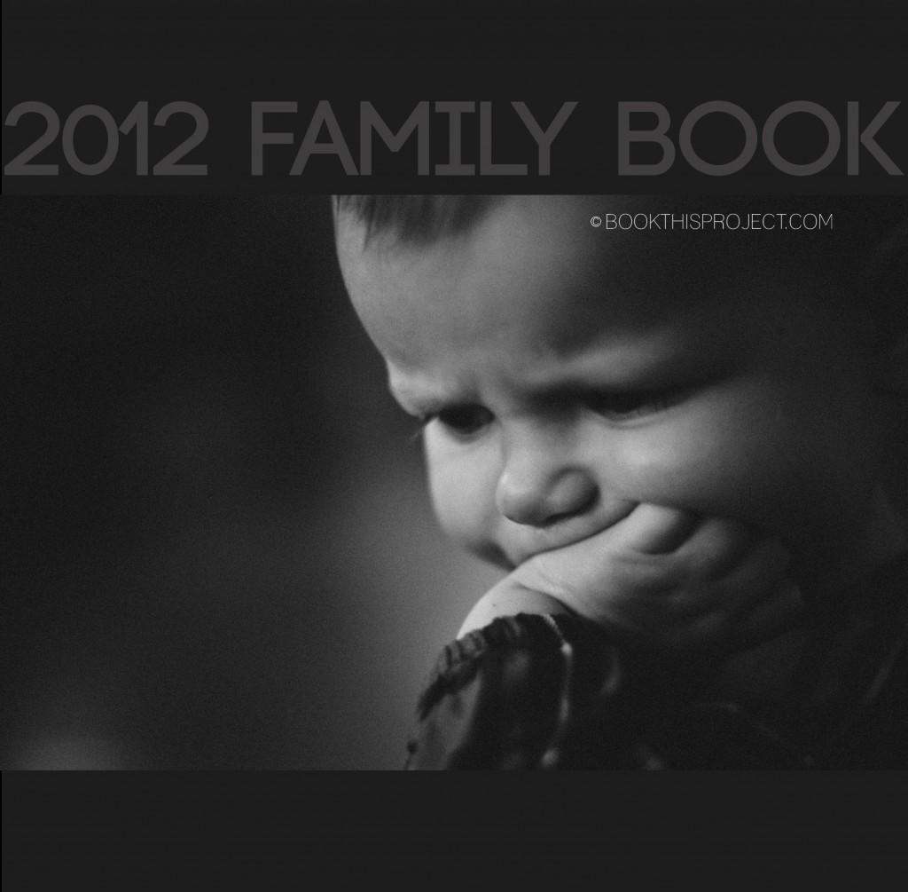
For this photo book cover, I am incorporating the two shades of dark gray with a black and white photograph. This gives the cover a stately simplicity that would perfectly set up a modern photo book. For the interior of the book, the same dark gray with light gray font could act as the section pages, dividing the custom photo book into months, seasons, or events!

[divider]Make sure you pin it!
[divider]

