by Stacey Wiseman | Jan 10, 2013 | Photograph, Podcast
January is the perfect time to assess the year that just passed and look forward to the upcoming year. Even with my family photos, I think it is important to review my photographs in order to figure out what I want to accomplish next year. (skin tones + consistent editing!)
I love seeing all of my photos in one place. It’s one of the main reasons I love photo books!
A little backstory. In May, the band The Walkmen released their latest album, Heaven. I immediately fell in love with the video of their title track. I loved the blend of music + family, stills + video.
I really wanted to capture this spirit for my own family.
I decided to implement this inspiration into my end-of-the-year video. It combines some of my favorite ‘mommy’ photos and videos. It’s not perfect. Some are out of focus. Some crazy skin tones. But I don’t care. I still love it. It is a perfect encapsulation of 2012.
I would LOVE for you to check it out.
2012 End of the Year from Stacey Wiseman on Vimeo.
Now! I would LOVE for you to make one of your own. In this month’s podcast, I take you behind the scenes to show you how I made this video. I provide all of the steps to re-create this on your own.
Here is your Game Plan.
1 – Download the tutorial.
2 – Print the PDF.
3 – Schedule about 4-6 hours to make one for yourself.
4 – Create your End of the Year Movie.
5 – Post and Share! I would love to see your video.
This is completely do-able!
Let me know your favorite part of the video or the best tip in the comments below!
Download
I’m trying out a new method for delivering the files. I’m working on unlocking the file right now. If you’re having problems, check back tomorrow! Thanks 😉
by Stacey Wiseman | Dec 6, 2012 | Photo Book Design Layout, Photograph, Promotions
And why should I consider it for my family photo book?
These are two very good questions!
I think printing a photo book, especially once a year, is so important. But let’s face it. Sometimes time runs out and you just don’t have the time at the end of the night or on the weekend to design your own family photo book.
I have an alternative for you! I will design your photo book tailored to your tastes. It is the easiest way for you to finally get those photos off your hard drive and printed all in one place.
I’m trained and practice as an architect and have a very modern, sophisticated design sensibility when it comes to design. But what does that mean?
Let me explain some of my design principles and why I think it is beneficial for you to consider my custom design services. All of the books below are examples of books I designed for others (including myself!)
1. I can match your preferred font.
This client wanted to match the font from her blog where she showcases her lovely Project 52 photos. With a bit of research, we found the font and I used it in the title of each page for her book. Now there is continuity between her blog and her photo book!

All photographs in this layout are copyright to Tamra Yandow. All rights reserved.
2. I can organize your book to your photos.
For this client’s book, she wanted to use her child’s artwork for sections. And she didn’t have a lot of photos each month, so she wanted her photo book divided into seasons, not months. I easily organized her book to match the amount of photos she had.

All photographs in this layout are copyright to the Shumaker family, 2011.
3. Custom design does not mean design, patterns, colors, lines, and font everywhere.
Sophisticated design relies on simplicity in order to elevate the photos on the page.
For this Project 365 book, I matched the color in her photo to expand it to a full spread layout. Now there are no distracting elements (even if white space) competing for your attention. Only her photograph!

This photograph in this layout is copyright to Suzie Mauro, Zo-mak Photography. All rights reserved.
4. I can design to a specific idea.
I had another client was curious how implementing circles would look in her vacation photo book. This approach is very difficult to achieve with the free design programs, however, very simple for me! (I’m still in the process of finalizing her book, so this is a sneak peek from her draft!)

Photos copyright Tricia Ebarvia. All rights reserved. No reproduction of photographs permitted without expressed consent from photographer.
5. I can include basic information, such as capture dates for photographs.
I like for all of the pages in my photo books to include a date when the photos were taken. This becomes very tedious when you design a book on your own. I love to go into this kind of detail for you!

6. I can match design inspiration from pinterest.
See a design you like? Pin it and I can use it as inspiration for your book. This is a sample of something I found. See how the first number tucks behind the photo and the second number is in front! This could make for a gorgeous section divider. It is simple yet has the design sophistication that shows thought and intent.

7. I don’t have to shy away from color or pattern.
Sometimes the careful use of colors or patterns add just the right touch for your photographs. For my family vacation book, I wanted just a bit of color and pattern to pop the photos a bit. This is not on every page. Only a few where I think it really works.

8. I can design special inserts or elements into your book.
For my 2012 photo book, I am going to provide specifically designed pages for the monthly projects I participated in. This is an example of how I will incorporate food – family meals, baking, recipes, etc. – into each month of my photo book. Every time I have one of these pages, it will follow a similar layout to keep consistency throughout the book.

Now you see what I can do! Whatever your book project idea – I would love to design it for you! Think of the stress and hours I can save you with absolutely beautiful results.
If interested, sign up to become a 2013 BTP Subscriber. For a monthly fee, you upload your photos each month and I will take care of the rest. Or for a book from any year, I have a family photo book option.
Right now, I am giving away one free hard cover book + custom design service to one lucky reader on my newsletter. To enter, make sure you are on my list by December 14, 2012! For more details, check out this thread.
If you want to learn my design techniques to implement yourself, sign up to find out when I’m offering my next Intro to Photo Book Design Workshop!
by Stacey Wiseman | Sep 3, 2012 | Family Photographs, Photo Book Design Layout, Photograph
My family knows I am not big on shopping. Rarely do I buy clothing for my kids (even more rarely do I purchase clothes for myself) but recently I met a wonderful woman in Lexington who owns a maternity and children’s clothing store in Lexington. Blossom is the store and anyone located in Lexington should definitely check them out. I realize most of the back-to-school shopping has passed, but if you need clothing for the fall, going to Keeneland, a special occasion, or a Christmas gift, I suggest you head there first.
I still have to get my boy out in his new shirt, but I spent an afternoon photographing my little girl in her dress. It is a little big on her…but this will give her plenty of time to wear it! I really love the colors of the dress. Of course she added the beads. She did get a little messy during dinner but I made sure to soak it water at the end of the evening and all it good!
[divider]
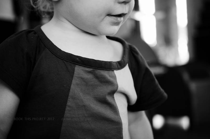
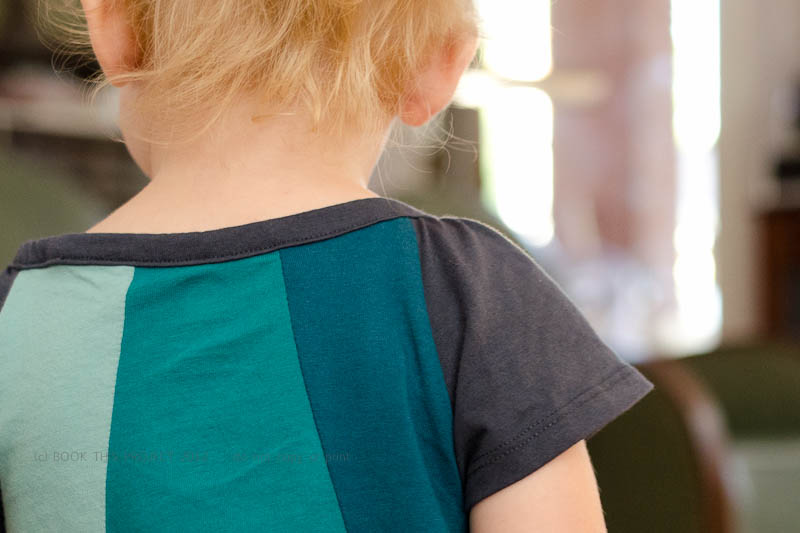
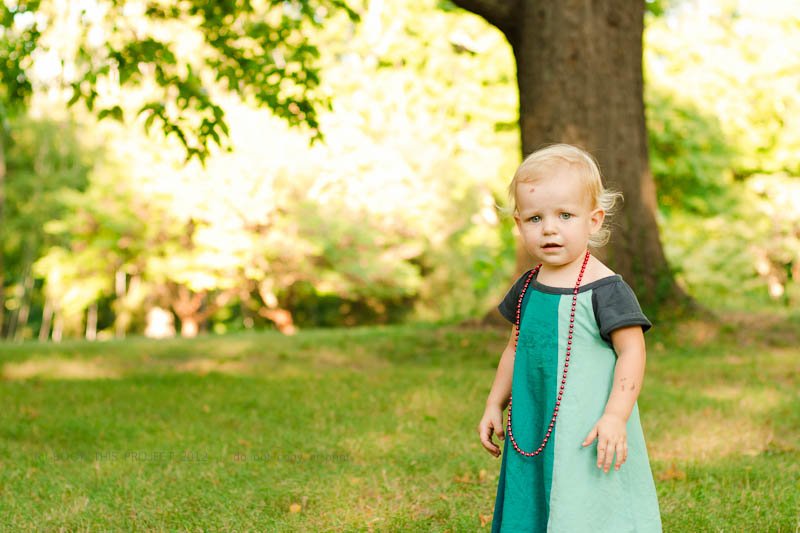
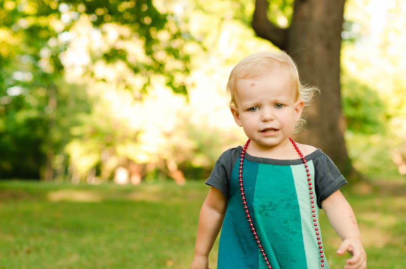
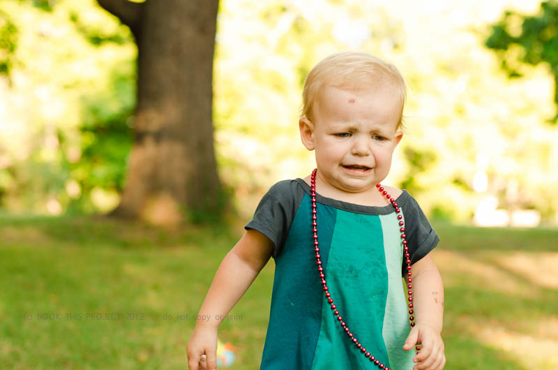
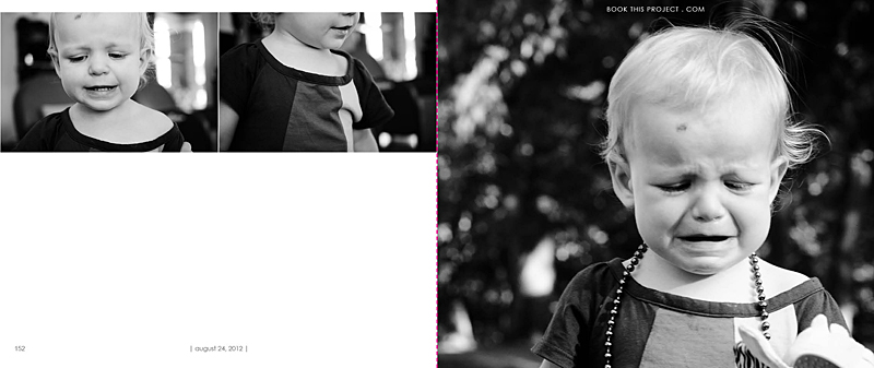
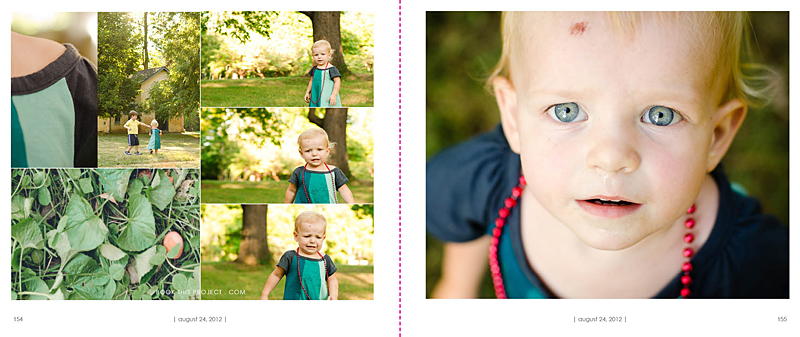
[divider]I thought you would enjoy seeing how these photographs translated into the pages for my annual family photo book. I love her smiles and her cries. Whenever I photograph her, I always work with her running away or looking away from the camera. We kept playing this game where I would get her looking toward setting sun and then I would run a couple of steps in front of her, turn quickly and then try to capture her as she was running back towards me.
Since I adore several of the photographs, I decided to dedicated four pages – or – two spreads to this set. The first page features the black and white photographs and the second page features a variety of photo at different scales, features and colors. Each pages features a page number and the date. The pink dashed line represents the fold of the pages and will not be included in the actual book.
[divider]Let me know what you think of her dress, the photographs and the layouts in the comments below!
If you love this example or if it gives you some ideas for your photo book, pin it!
[divider]Make sure you sign up for my weekly newsletter. I have a free download of 50 things to shoot for your photo book when you sign up! (click the image below)
by Stacey Wiseman | Jun 14, 2012 | Family Photographs, Inspiration, Photograph
Now that it is June, it is time to start thinking about and taking summer photos. To me, that means picnics, barbecues, and nothing says summer quite like a pool photograph. I love Lynne Rigby and I love Lynne Rigby’s photographs. She is amazingly talented – both with her camera and teaching. Truly inspiring lady. But…today…I want to focus on her pool photographs. I loved so many of them last year and already a little giddy for her photographs this summer.
Her photographs highlight the sun sparkle, the waves of the pool, and her kids in and out of the water. Here is a great photograph to get you inspired for your pool photographs this summer. And just warning you…there may be more. Seriously love her!
I want to see your summer photographs! I have started a flickr set that you can link your photograph to. Or you can always leave a comment below with a link to your blog post, Facebook page or flickr set. Love to see each other’s work!!!
by Stacey Wiseman | Jun 1, 2012 | Description, Family Photographs, Inspiration, Photo Book Design Layout, Photograph
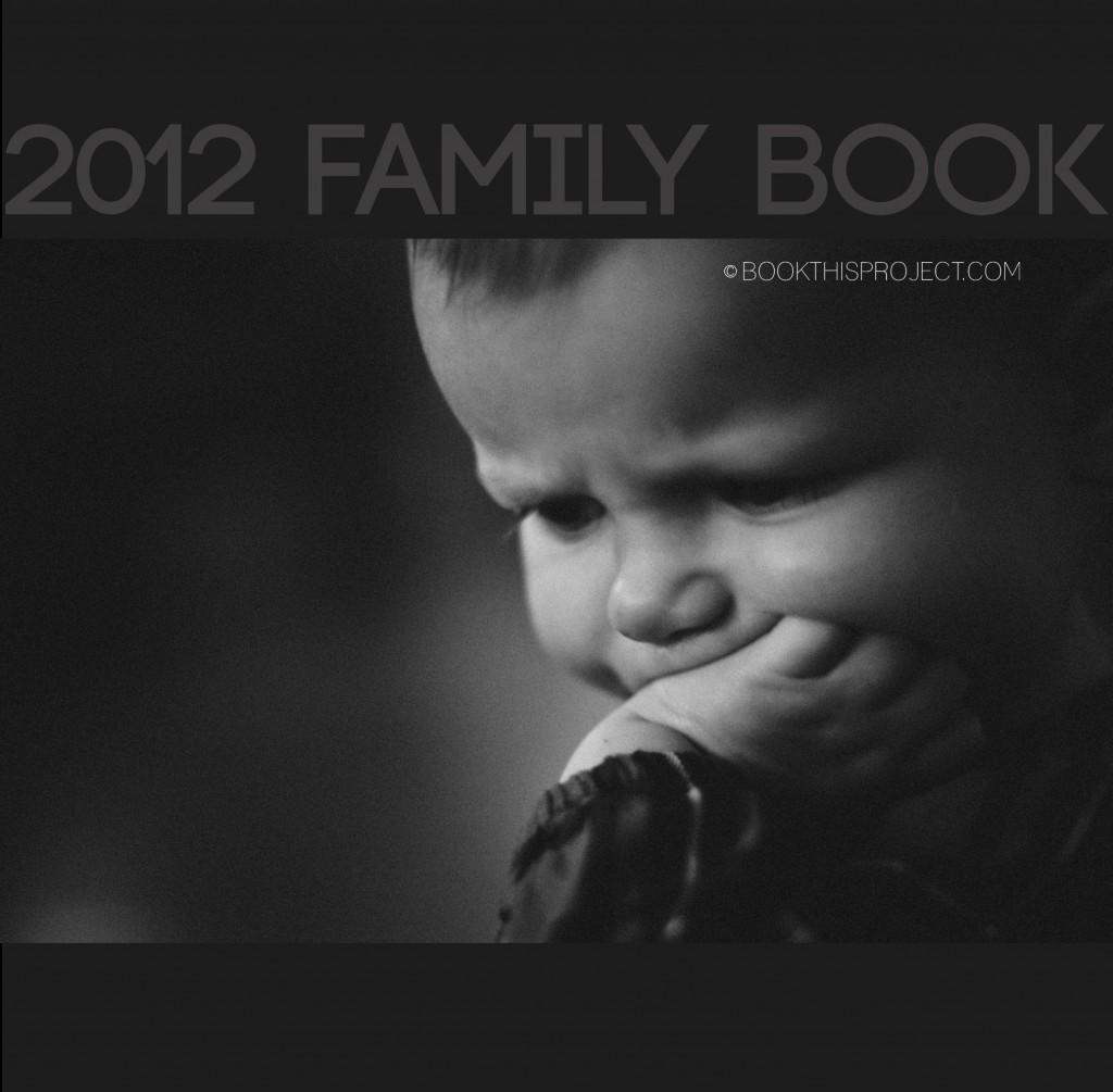
For this photo book cover, I am incorporating the two shades of dark gray with a black and white photograph. This gives the cover a stately simplicity that would perfectly set up a modern photo book. For the interior of the book, the same dark gray with light gray font could act as the section pages, dividing the custom photo book into months, seasons, or events!
[divider]Make sure you pin it!
[divider]
by Stacey Wiseman | May 29, 2012 | Description, Family Photographs, Motivation, Photo Book Design Layout, Photograph
The following is an example of my May page for the One Word Challenge. For this layout, it is only 1 page with a simple border around a 5″x7″ photograph.
by Stacey Wiseman | May 24, 2012 | Description, Family Photographs, Motivation, Photo Book Design Layout, Photograph
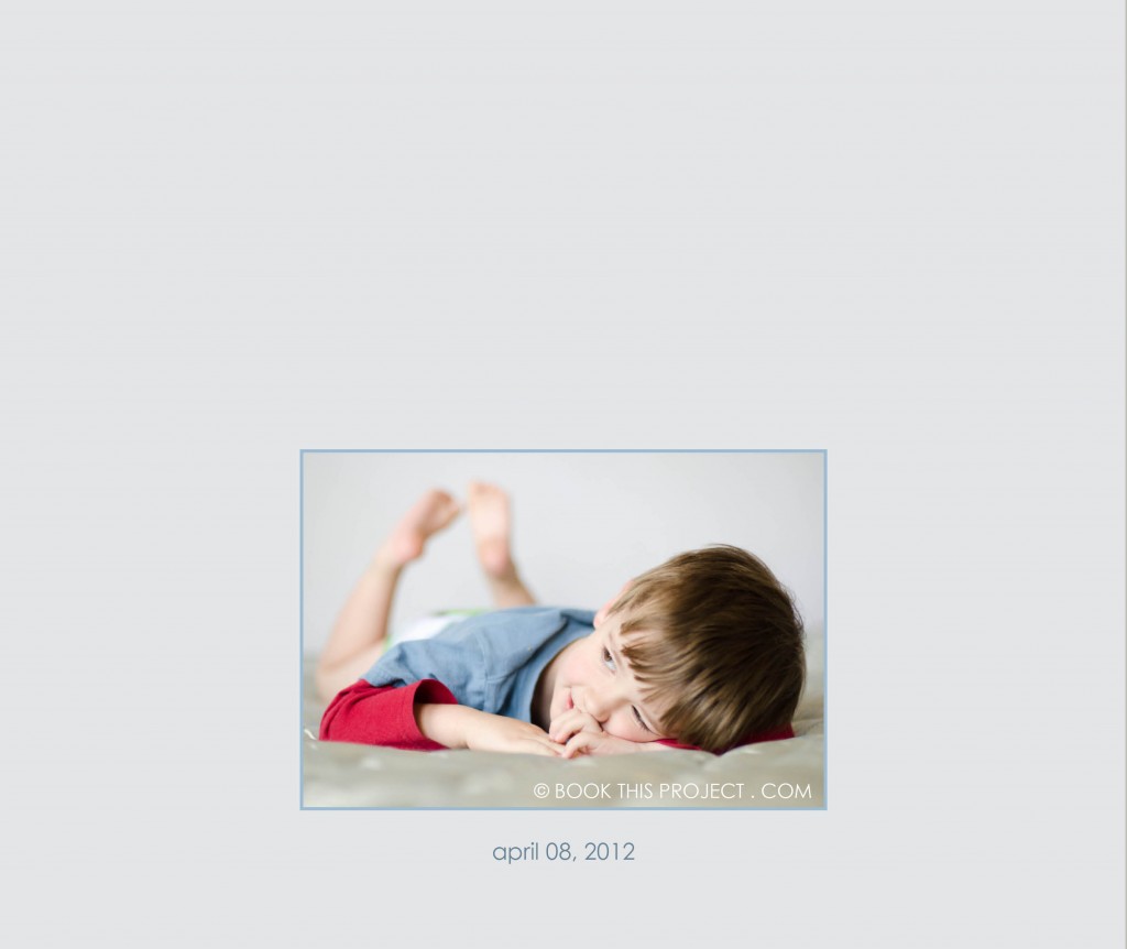
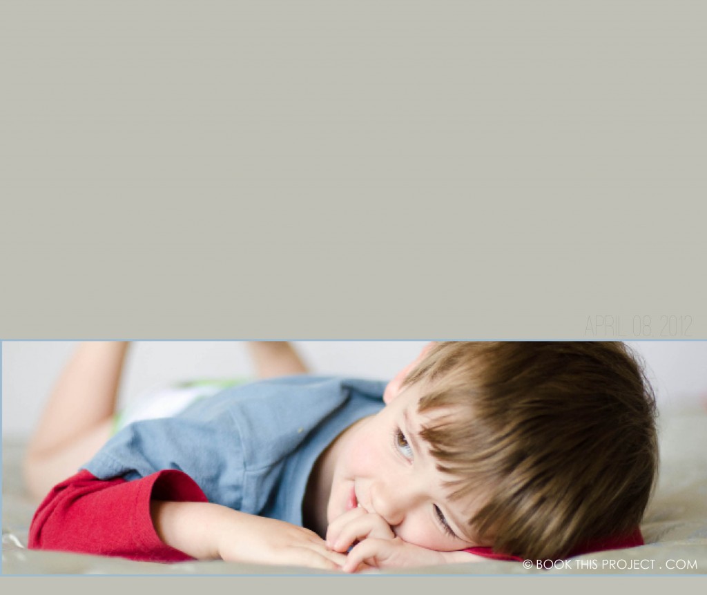
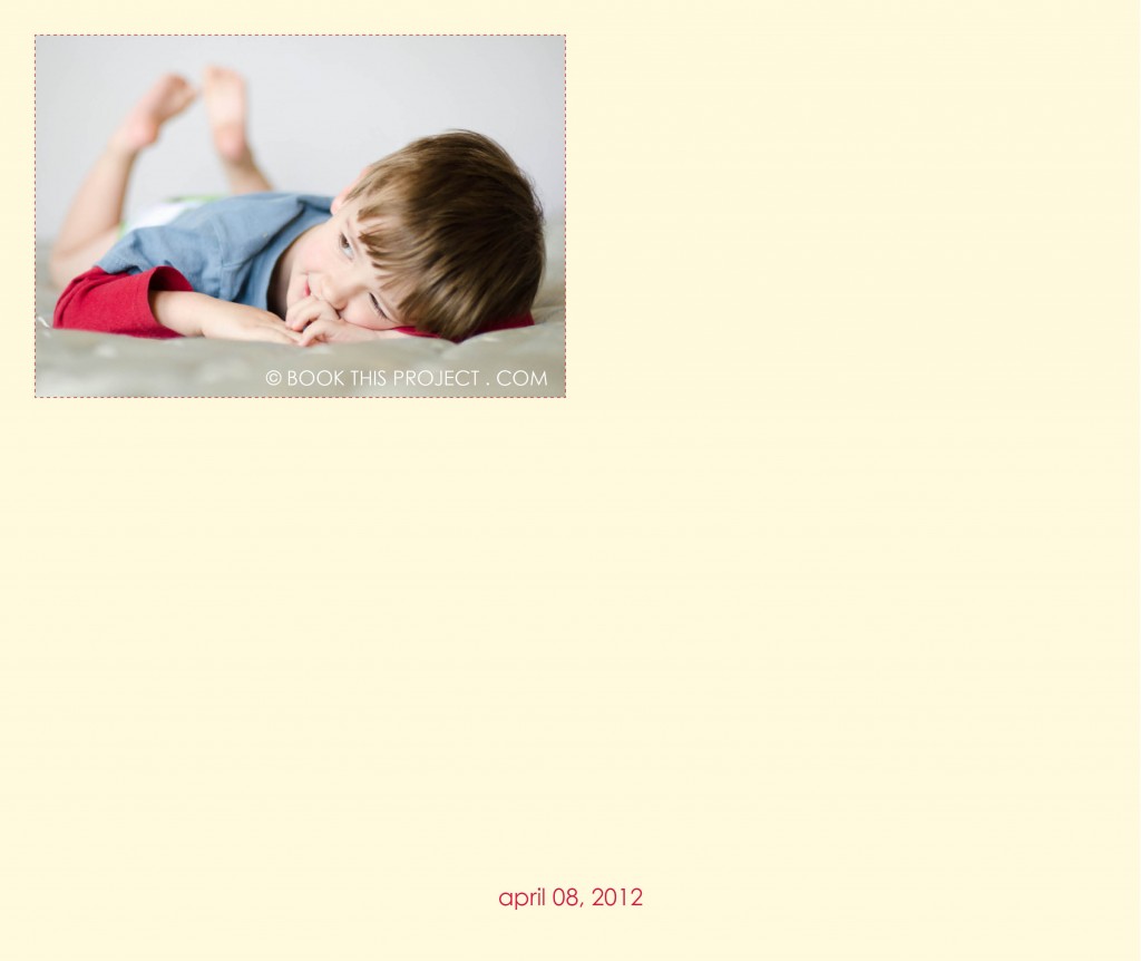
Here is the next entry in the Book This Project Color Series!
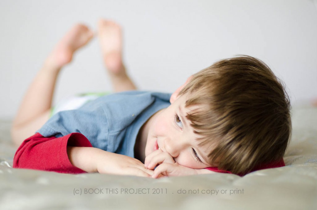
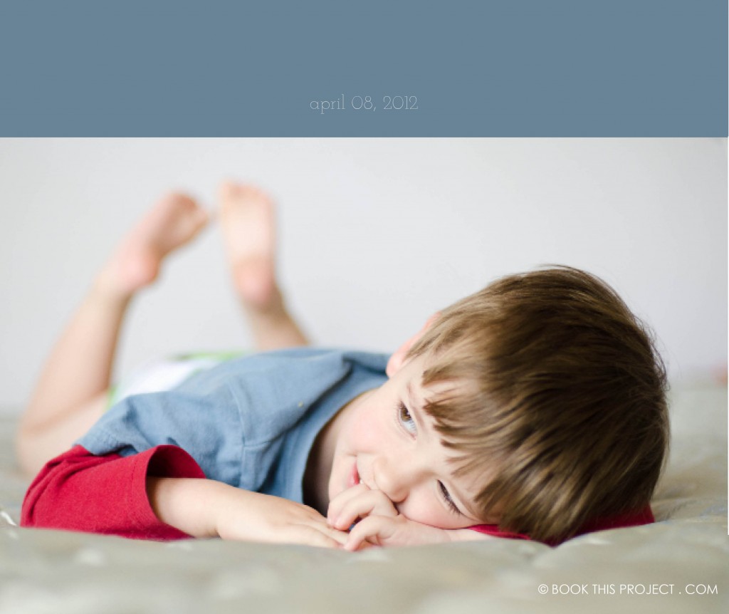
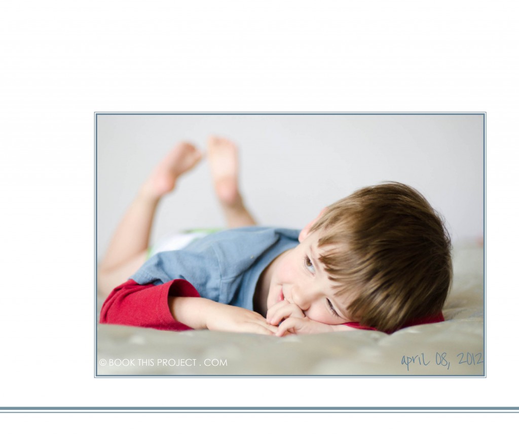
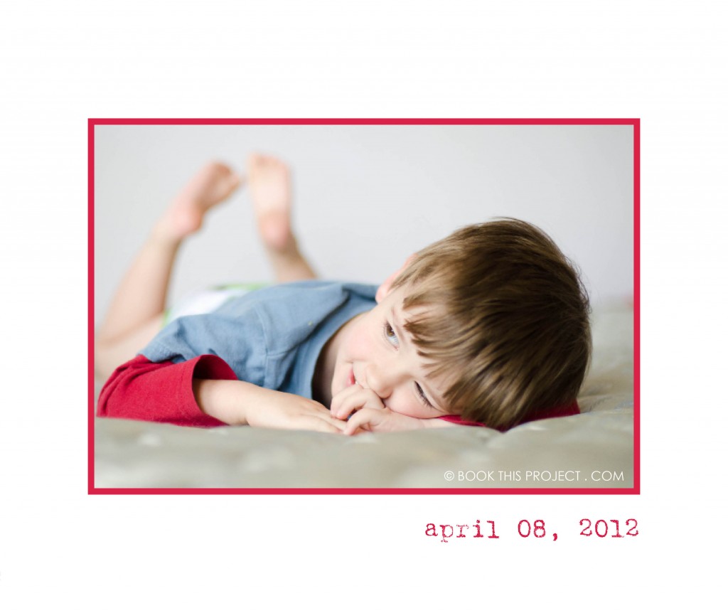
Here are six color options to pair with a photograph in a landscape size photo book. Submit your photograph to info[at]bookthisproject.com and I will prepare a color profile for you!
Let me know in the comments below, which one is your favorite?
[divider]Here is the original photograph from yesterday’s wordless wednesday post:

[divider] the colors:
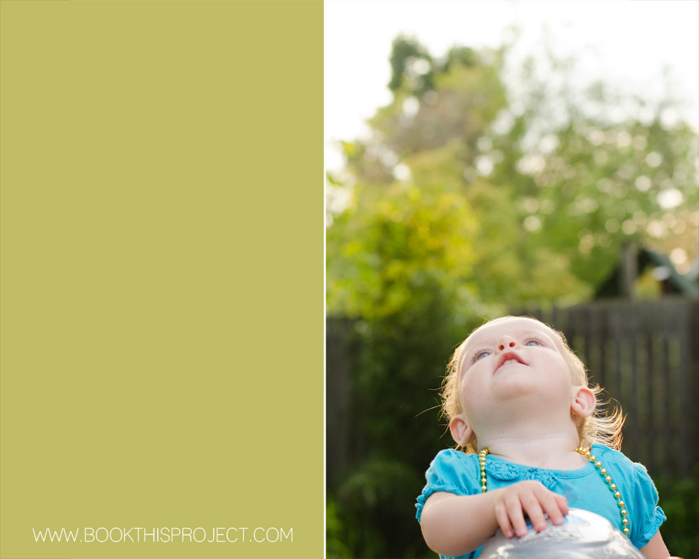
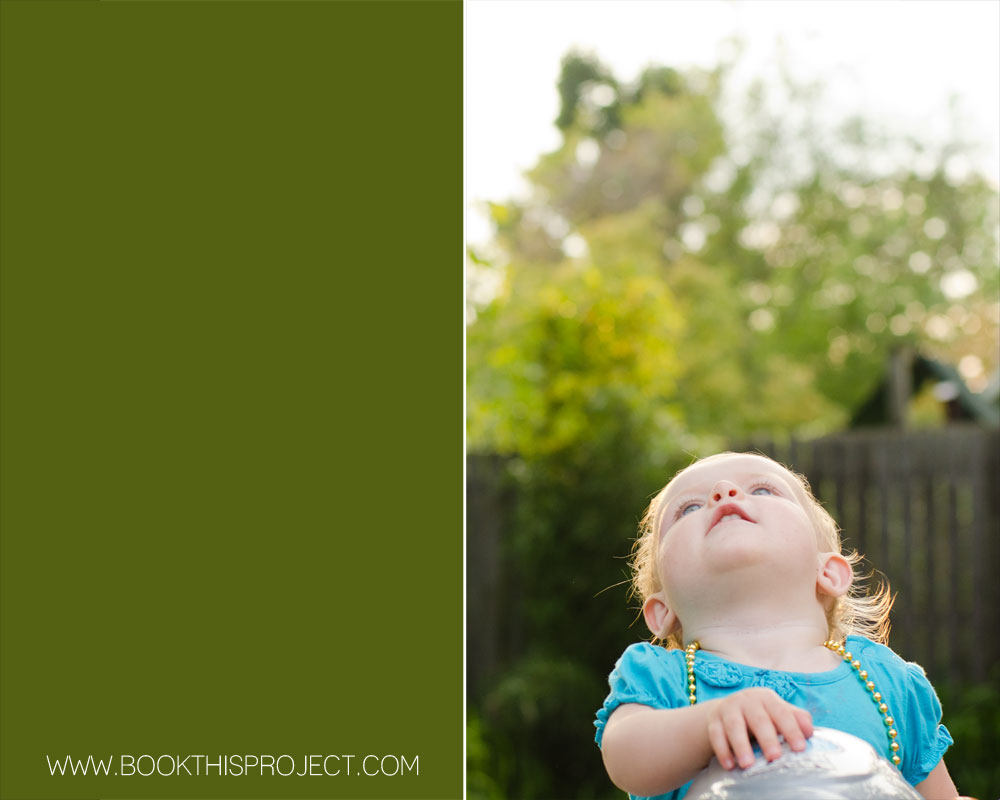
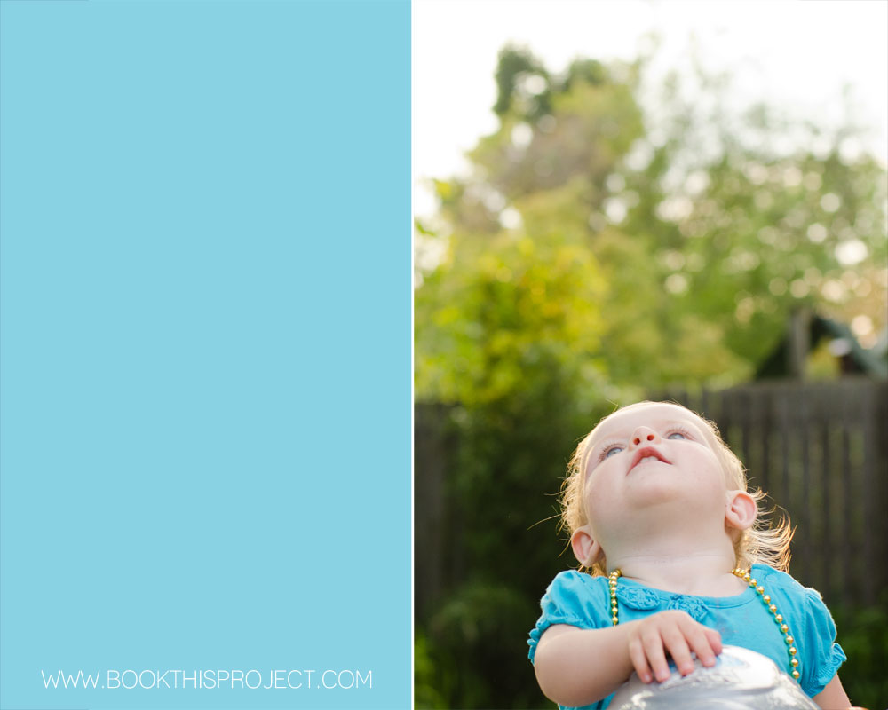
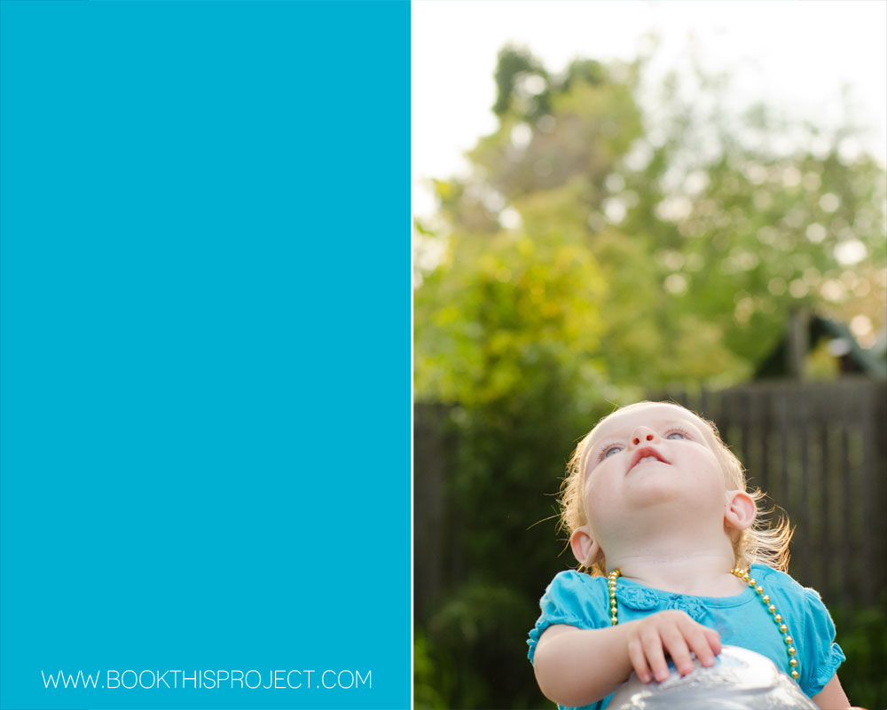
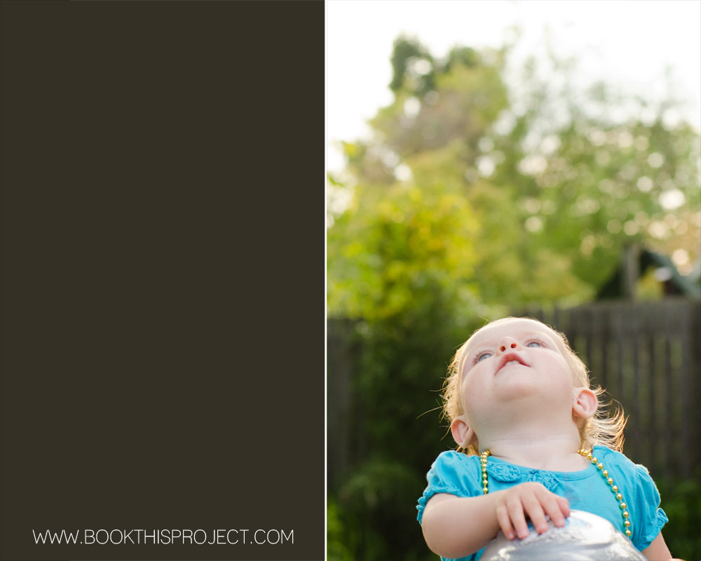
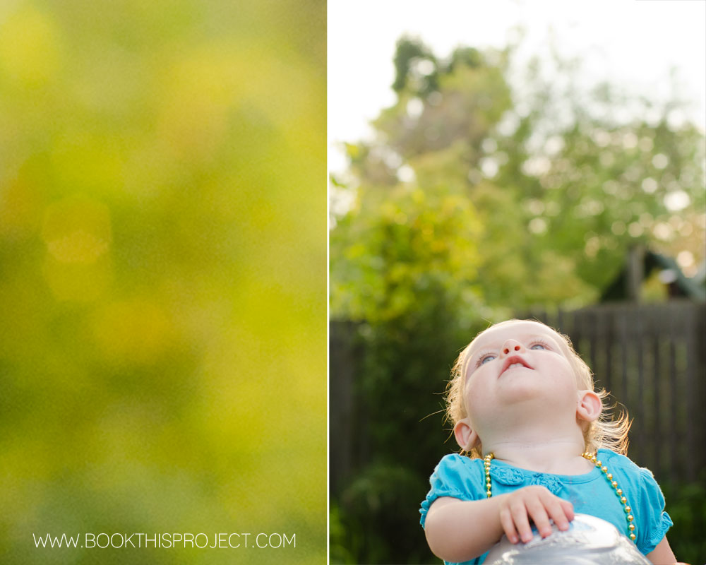 [divider] A free download of the color values are located here:

by Stacey Wiseman | May 7, 2012 | Description, Family Photographs, Inspiration, Photo Book Design Layout, Photograph
COLOR! It is so important in design and can add so much to your photo book layouts. I have decided to start a new monthly series that examines the impact color has on layouts. I will take a photograph – or a group of photographs – and run through a series of different design layouts – exploring color, type, size, orientation, and proportion.
First, to start off this series, I want to mention the beautiful and inspiring site: Design Seeds. If you are not familiar with them, I hope you will check out their site, facebook page or pin boards. This site examines the rich color groups found within evocative photographs. If you are ever in a color rut or looking for color inspiration, you should check out their work!
Photo

[divider] Layouts


[divider]Get a free download listing the colors used in this series (RGB and CMYK) – here!
[divider] Would you like one of your photographs featured in this series? Email me your photograph and I will let you know when your photo will appear.
I hope this gets your creative juices flowing!
And if you love any of these, share this post on your facebook page or pin your favorite(s)!
by Stacey Wiseman | May 4, 2012 | Description, Photo Book Design Layout, Photograph
Here is another entry in the 2012 cover design series. Make sure you pin it!

by Stacey Wiseman | Apr 28, 2012 | Description, Photo Book Design Layout, Photograph
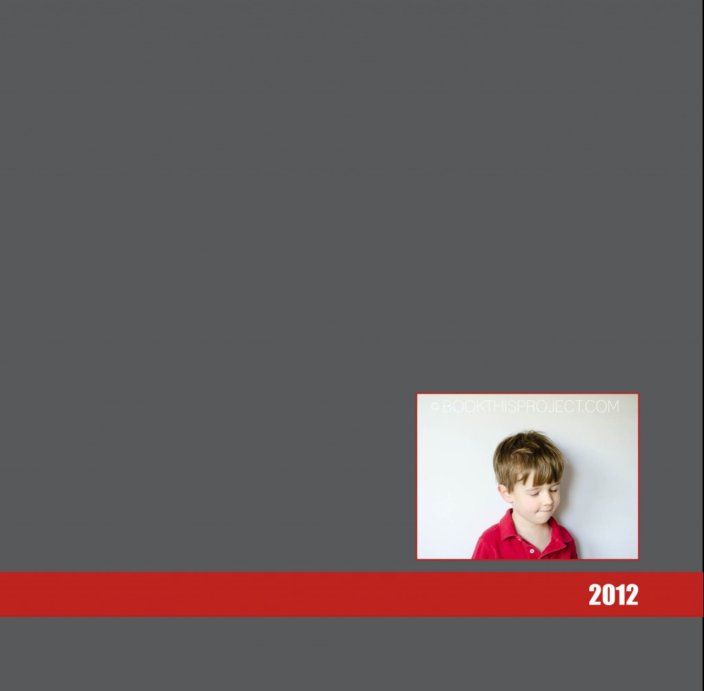
I have decided to start a little series on 2012 family photo book covers. All of these will be featured on this blog + pinterest board…so make sure you follow it!
For the first issue, I based the cover design on this email I received from J.Crew. I loved the two variations of the same color: light and dark.

[divider]Here is the cover:





 [divider]
