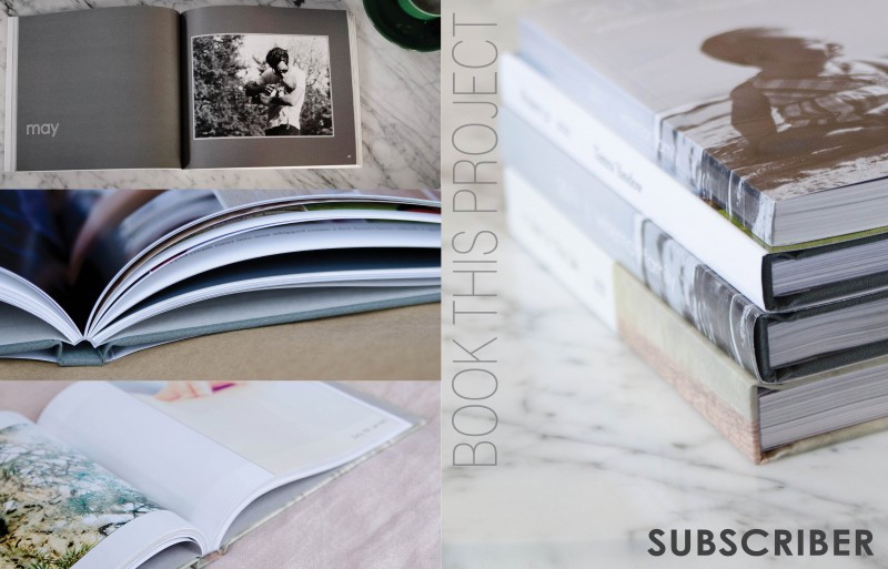
by Stacey Wiseman | Apr 12, 2013 | Cover Series
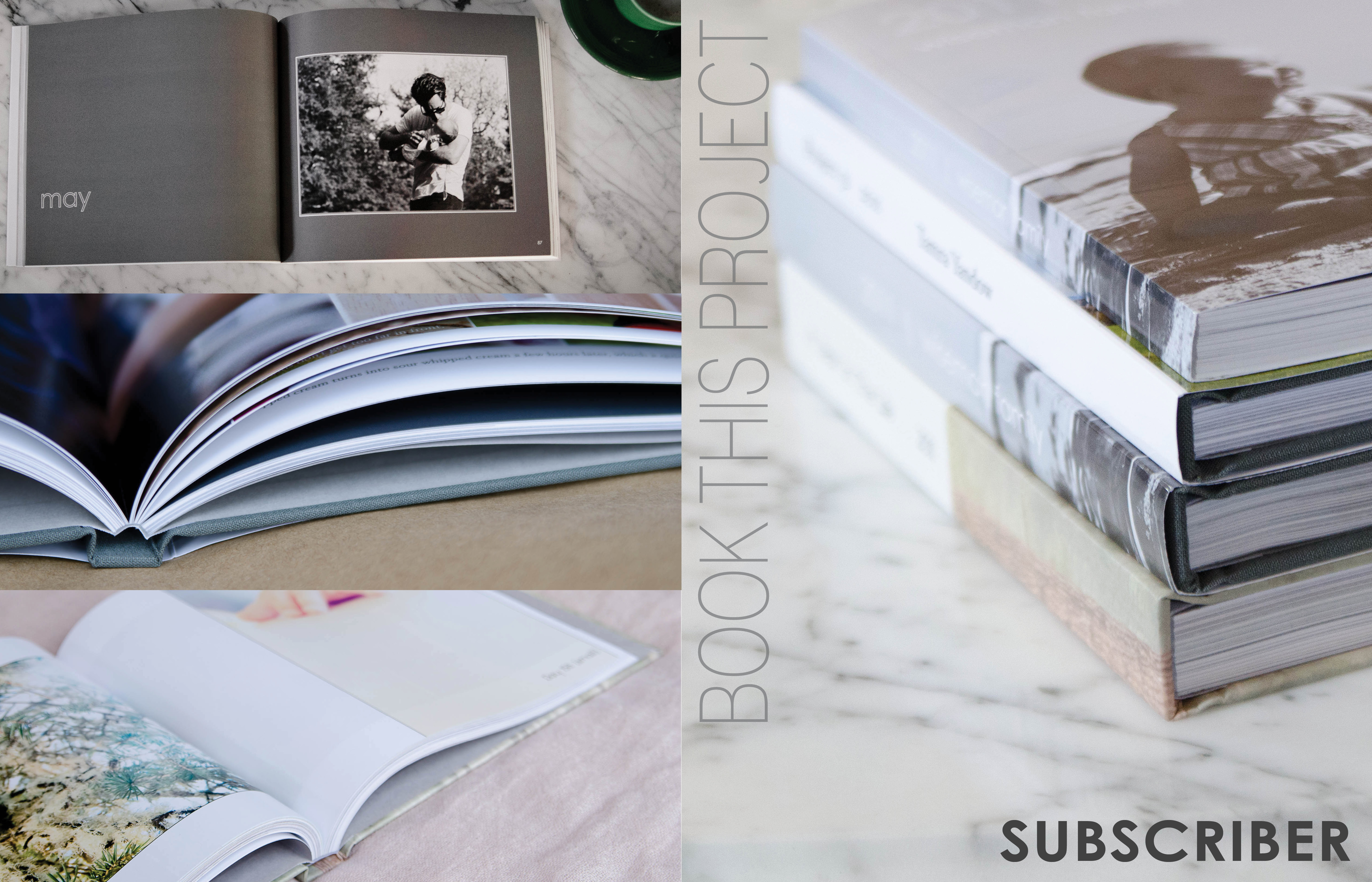
I prepared a special little design project for all of my photo book subscribers and clients. I wanted a cover design that had one descriptive photo on the front cover and the back provided three sample photographs. The vertical text is a thin font style which contrasts the bold font in the lower right corner.
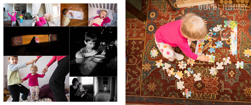
by Stacey Wiseman | Mar 14, 2013 | Family Photographs, Photo Book Design Layout, Podcast
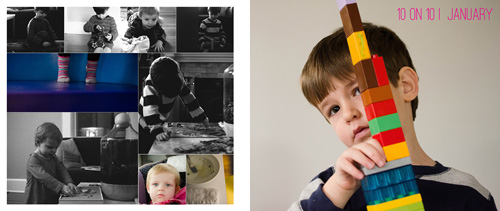
In this month’s podcast, I’m showing you how I design my family photo book, step by step. For this video, I’m illustrating how I designed my January and February 10 photos in 10 hours challenge.
Even if you are not participating in this challenge, it will show you how I export and select my photos for a layout.
If you are designing your own photo book, I hope you’ll follow along with me as I design my 2013 book. And if you’re interested in having me design your photo book, this will provide some insight and tools into what I can do for your photographs!
If you have any questions or comments, make sure to leave them in the comments below!
by Stacey Wiseman | Jan 7, 2013 | Family Photographs, Photography Tip
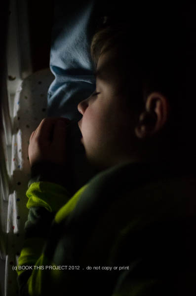
Last week, there was a great post on Clickinmoms about low light photography by the talented photographer, Megan Dill. I can definitely relate to what Megan wrote. I also work outside of the home and during winter time it becomes very challenging to photograph because most of the light is gone by the time I get to see my kids.
But I decided to take her post as inspiration and try a similar type shot she included in the post. Deciding against a self-portrait (for now…), I went with one of my son. I used a flashlight app from my iPad, manual focus, and the quiet mode on my D7000 camera. These were taken at 11:30pm!!!
The top photo I left in color and for this one I converted it to a black and white.
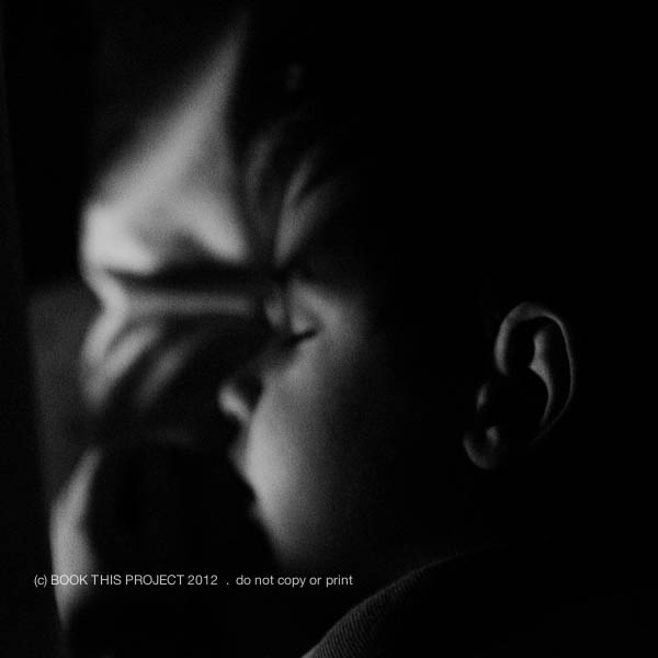
Make sure you check out this article and try out some of Megan’s tips. January is the perfect time.
What are you favorite low light photographs? Leave a blog link below – I love to leave some love!!!
by Stacey Wiseman | Jan 4, 2013 | Design Series, Photo Book Design Layout
It is time to start the next Design Series! Every Friday, I like to post a different photo book cover design to inspire you for your photo book. This year, I may start to include design layouts, as well.
This cover comes from a recent family vacation book I completed. I will blog about this book later this month…but I love the cover. I thought this photo was perfect for the cover, so much so, that words were not required. The only text occurs on the spine of the book.


Photos copyright Tricia Ebarvia. All rights reserved. No reproduction of photographs permitted without expressed consent from photographer.
by Stacey Wiseman | Nov 30, 2012 | Family Photographs, Photo Book Design Layout
This year we took a family vacation to South Carolina. At the end of October. Not exactly beach season. But the weather was fantastic for us. Comfortable, clear blue sky, not too hot, but definitely sunnier than the place we left. One morning of our trip we decided to go fishing for crabs. I decided to be brave and only take my 35mm film camera loaded with Ektar 100 film.
My mother-in-law ended up catching two crabs. Not a lot…but better than I expected. Even though my son sat around and watched for most of our time on the dock, he still felt part of the action and really enjoyed it. While we were waiting for the crabs to bite, a seasoned fisherman pulled up with his baskets and baskets of crabs.
Here are some of my favorite from the trip.


Now, how will all of these photographs translate into 2 pages (left and right) of a photo book? I wanted a layout that is simple and focuses on the actual act of fishing for crabs. I wanted a subtle caption of “crabbing” to describe the day. And, like all of my layouts, I wanted to include the date of when the photographs were taken. So here is what I came up with!

Leave a comment below and let me know what you think of the film photos or my layouts! I definitely need more practice…but I get so excited when I see my film experiments!
by Stacey Wiseman | Nov 15, 2012 | Photo Book Design Layout, Podcast
Are you planning on designing and ordering a family photo book before the Christmas holidays? If so, the dates are quickly approaching to when you need to finalize your design and place your order. Even though the ordering process can seem straightforward, reviewing before you order is critical to ensure a gorgeous book.
 Here are 7 simple steps to follow before you press “Order.”
1. Fix warnings
Most free online programs alert you of potential errors to your design. A common error is the image resolution being too low. You need to reduce the size of image or re-save the image at a higher resolution. Another example involves text that does not fit the text box. In this instance, you need to lower the size of the font or increase the size of the text box.
2. Ensure photos extend to edge of photo boxes and bleed edges
For any photos you want to bleed off the page, make sure they extend to the bleed line.
3. Review consistent elements (text, borders, page numbers)
If you established consistent elements at the beginning of the design process, check every page to ensure all elements have been consistently applied. This includes all text styles, borders, headers and / or footers.
4. Read through all captions
Read through all captions for any grammatical or spelling errors. A great tip is to read all text aloud. I tend to catch more mistakes this way!
5. Preform a spell check
Most programs will also have a spell check. Check the entire document before you order.
6. Print a proof, if desired
This step takes the extra measure to verify proper grammatical and design elements. Sometimes we fall into the illusion that we can catch everything on screen. Printing out your draft and reviewing the proof is visual proof you have got the book exactly the way you want it. Get out that red pen of yours and mark up your proof.
7. One Final check
After you have gone through the six steps above, I go through each page in preview mode one last time to see if I notice anything else. If I have no additional edits, I’m ready to hit that order button!
As some of you may know, my family recently returned from our yearly beach vacation. I prepared a photo book documenting our vacation. Here are a couple of pages of my book.
[divider_flat] I went through all of the 7 tips listed above and pressed “Order.” Want to see what happens next?
Watch this quick video below to de-mystify the ordering process!
Leave a comment below to let me know when you plan to order your photo book!
by Stacey Wiseman | Oct 26, 2012 | Cover Series, Photo Book Design Layout
Description

If you love this example or if it gives you some ideas for your photo book, pin it!
[divider]Make sure you sign up for the Book This Project weekly newsletter. I have a free download when you sign up!
by Stacey Wiseman | Oct 11, 2012 | Photo Book Design Layout, Podcast
If you have been following along with the monthly podcasts, you know we have been building up a photo book. In July, we outlined a photo book in pages/excel. In August, we outlined the book in the a design program.
For today’s video, I am showing how to design the book page by page.
Let me know in the comments below: What is your most efficient technique for designing your photo book?
by Stacey Wiseman | Oct 8, 2012 | Description, Inspiration, Tutorial
") Are you looking to improve the quality of your photo books?
Are you looking to improve the quality of your photo books?
Do you need extra motivation to complete your family photo book this year?
Enroll in this Introduction to Photo Book Design Workshop!
In 4-weeks, we will take your to-do list item and make it a reality. Perfect timing to have your photo book ready as a Christmas gift – or – end of year gift to yourself.
This Design Workshop is designed to help inspire and instruct you as you organize, prepare, and design your photo book.
Included in this purchase are:
- pdf’s with narrative, photos, & examples of layouts
- videos explaining how to implement the lessons
- detailed action plans to develop your personal photo book
- a private facebook group to ask questions and share examples
- bonus materials
The course runs 4 weeks.
Each week there will be a different lesson with examples and videos.
The start date is October 15, 2012.
This course only runs this year and is limited to 20 participants.

[divider] Some, but definitely not all, of the material will include videos that have previously been posted to the blog. The advantage in this course, it presents the materials in an organized fashion, ideally suited for you to follow along as you design your book.
By the end of this four week course, you should have your book almost finished…all you will have to do is add your November & December photos!
To be clear, this is not a design service for me to design your book. You will be responsible for organizing, cropping, preparing, placing and designing your own unique vision for your book.
This course will:
- instruct you on how to efficiently organize and design your book
- inform you on how to use the free software program provided by companies
- design principles to ensure a professional quality book
- inspire you to create a stand-out, beautiful book
A summary of the lessons:
Week 1: Photos
- Organizing Photos
- Quantity of Photos
- Editing Photos
- Exporting Photos
Week 2: Photo Book Design
- Organizing & Outlining a photo book
- Consistency with Variety layout design
- Placing Photos
- Creating Master Layouts
Week 3: Professional Elements
- Fonts/Text
- Color
- Sections/Table of Contents/Page Numbers
- Ways to Customize
Week 4: Cover Design and Finalize
- Cover Design
- Final Review/Edits
- Ordering
- Sharing
The purchase of this design workshop is non-refundable.
To purchase, click here.
by Stacey Wiseman | Sep 28, 2012 | Cover Series, Photo Book Design Layout
This cover design is similar to last week’s design, yet in this case, the font is bold and bright. You don’t have to go with a black background to get a cover like this, but I suggest selecting two contrasting colors for the background and the font color. You want there to be a difference in order to make the font really stand out.

If you love this example or if it gives you some ideas for your photo book, pin it!
[divider]Make sure you sign up for the Book This Project weekly newsletter. I have a free download when you sign up!


")


